




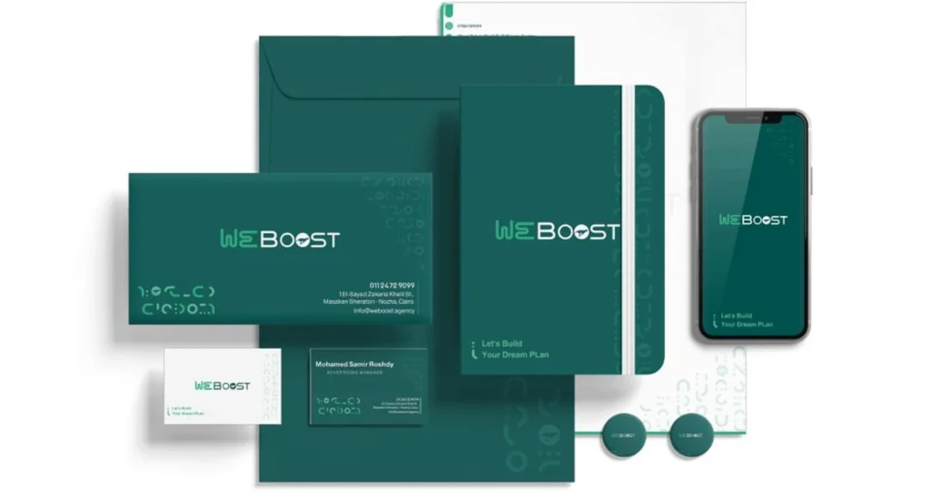
Brand identity that survives contact with real marketing
A logo is the smallest part of an identity. What determines whether a brand looks coherent six months later is the system around it: a colour palette with defined roles, a type scale that works in Arabic and English, spacing rules, and templates for the formats you actually publish in every week.
We build that system and document it, so an ad designer, a web developer and a print supplier all produce work that looks like the same company. For bilingual brands this matters more than usual, because Arabic and Latin typography need deliberate pairing rather than the same font forced into both.
- Logo with usage rules, clear space and minimum sizes
- Colour system with defined roles, not just a palette swatch
- Arabic and Latin type pairing that works together
- Brand guidelines document plus ready templates for social and print
Frequently asked questions
What do we receive at the end?
Source and export files for the logo, the full colour and type system, usage guidelines, and editable templates for the formats you publish in most often.
Can you refresh an identity instead of replacing it?
Often that is the better call. If the existing mark carries recognition, we keep it and rebuild the system around it — colour, type, layout and templates — which is faster and loses no equity.
Do you handle Arabic typography properly?
Yes. Arabic and Latin faces are paired deliberately for weight and rhythm rather than defaulting to whichever font happens to support both.